Making Responsive Layouts without using Media Query
Hey everyone! 👋 This has been the talk of the hour since grid and flexbox came into the world with their perky aspects of making your content flow responsively around the viewport. 📱
However it can be frightening too 😨 for those who are starting out on these advanced CSS technologies like grid and flexbox, who maybe able to design good-looking layouts 🤩 but not make them responsive without the need of media queries.

🤷♂️ Stuck? Media queries are your saviour.
It turns out that writing media queries were like the de facto standard of making responsive design until the era of floats and clearfixes. However after the launch of grid and flexbox, this hasn't been so. People have come up with ways of not writing lots of media queries and still getting their page awestruck responsive look. 🤗
So, shall I stop writing media queries anymore? 👀 As a matter of fact, no, because media queries will always be there for you if you're stuck somewhere. They are always at your service, but the question is are they really worth writing in that place? If you find no other way to make it, here's your @media query. 💁♂️
🚈 Where to Start?
Well, that's an open question. I won't walk you through building the next Twitter or Facebook in this blog post, rather give you a simple analogy of the things you'll need in order to make things responsive. Mind the words, simple. Yes, you've got this. 💪
I want you to have a basic knowledge of flex and/or grid for this, or even the idea of what they are or how they work. You can always come back here after having an idea.
🕸 Let's Get on Grid.
🧝♂️ How to setup the grid structure?
We know after writing display: grid , we need to define the rows and/or columns for the layout. As we are making a responsive layout here, which is dynamic as to fit various viewports this can't be something static like in pixels or rems. We need some grid magic here. 💫
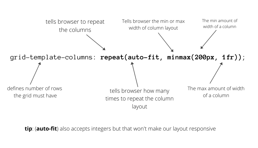
How to define our grid layout?
Believe it or not! 😱 This above line of code is all it takes to set you up for a basic responsive layout such as the one down below. Let me tell you, you also don't need to define any rows as the grid figures it out automatically. 🤖 Apart from this, you might wanna add a custom grid-gap to give some beautiful whitespace among them. 😎
The Original Grid Layout
Ofcourse, there are some additional styling here required to achieve this, but I think grid was the trickiest part. We've just given some styling to all items here to give it a box look! 🥳
🐒 Why auto-fit everytime?
Huh, it's not much everytime, but there is also one property called **auto-fill** which you can use according to your requirements.
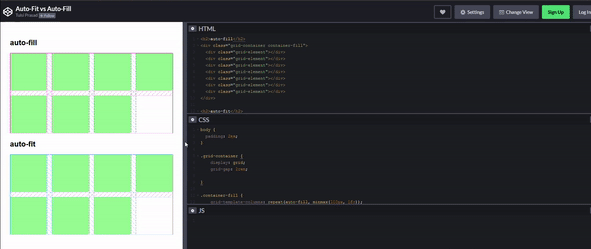
Difference between auto-fill and auto-fit
The auto-fill makes more columns of its size when the viewport is increased in width, rather than fitting to the viewport whereas the auto-fit does the opposite. It stretches it's items to obtain the full viewport width. So you can now use, any one of them as per your requirements.
Further reading on this down below.
⚡ Let's get to Flex
Flexbox are the one dimensional containers which can prove quite amazing for layouts that only need flow in one direction. So it definitely fits into our use case.
PS: Although the key here isn't making the whole webpage responsive without using even one media query but even if it does make a single section of the page responsive it's worth it.
✨ The Amazing flex-wrap Property
This is the line, that makes everything as it should be. So, flex-wrap is a property described on flex containers that decides whether the flex items are forced to stay in a single line or can be flown to multiple lines, i.e. responsive style. 🌠

Properties of flex-wrap
So, in our case we are going to use flex-wrap: wrap to wrap the items in the flex container to give a shiny little responsive feel to our section. We also use a tiny justify-content: space-around to give a more symmetrical look. 😎
🌈 Can I make responsive layouts now?
Yep. You have learned the concepts behind making awesome layouts. You can start from my codepens above, just fiddle around with the code and then replace the colored blocks with your contents and go slowly. You'll get there. Remember, you always have the @media queries at your disposal, so if you really need them, feel free to use.
📚 Further Reading
- Fill or Fit? What’s the difference?, by CSS Tricks
- Flex Wrap, by CSS Tricks
- I strongly recommend watching the channel, Layout Lands by Jen Simmons.
- Realizing Common Layouts using CSS Grid Layout, by MDN Docs
I'm a lot cooler on Twitter, @heytulsiprasad. Let's hang out. 🎉🏖